


The interface of the slider is setup from an external CSS file that you can find within the examples from the SliderWall package. The CSS file contains styling rules for the slider's various elements: navigation buttons, bullets, thumbnail images, horizontal or vertical playlist items. All the CSS classes defined for SliderWall have the prefix sw_ so as to be separated from other class names that might have a similar name.
Change sizes
Resize the slider
The size of the slider is defined in the CSS file, within the .sw_container class. The width and height properties define the size of the entire slider instance. Change their values to change the size of the slider.
.sw_container {

  width: 850px;

  height: 500px;

}
Once you change the size of the slider make sure, if needed, to change the size of the control bar - the container for the bullets and thumbnails or the horizontal/vertical navigation control bar.
Resize the bullets and thumbnails within the control bar
The control bar size is specified within the .sw_controlBar CSS class. Once you resize the control bar you should check to see if the control bar background should be resized as well. You can resize the control bar background from the .sw_controlBar_background.
The bullets and thumbnails are placed inside their own container, within the control bar. By default, the size of the thumbnail container is specified as percentage but you can set a new size from the .sw_controlBar_thumbnail_container class.
.sw_controlBar {

  width: 800px;

  height: 50px;

}


.sw_controlBar_background {

  width: 800px;

  height: 50px;

}


.sw_controlBar_thumbnail_container {

  width: 90%;

}
Resize the horizontal/vertical navigation bar
The navigation bar of the SliderWall Horizontal and SliderWall Vertical templates is divided into 9 cells or containers (3 rows x 3 columns), each container having its own CSS class. The middle container has the actual items list. The outer containers can be used to add margins/spacing or specially designed borders to the items list.
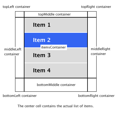
When resizing the navigation bar by changing the width and height values of the .sw_controlBar class, make sure that the total size of the containers is equal to the size of the navigation bar. This means that the sum of the width for the left container added to the width of the middle container added to the width of the right container, on each of the three rows must be equal to the total width of the control bar. The same goes for the height of the control bar: the sum of the heights of the top container, the middle container and the bottom container on each column must be equal to the the total height of the control bar.
.sw_controlBar {

  width: 250px;

  height: 350px;

}


.sw_controlBar_topLeft {

  width: 0px;

  height: 0px;

}


.sw_controlBar_topMiddle {

  width: 250px;

  height: 10px;

}


.sw_controlBar_topRight {

  width: 0px;

  height: 0px;

}


.sw_controlBar_middleLeft {

  width: 10px;

  height: 330;

}


/* This is the center cell of the control bar */

.sw_controlBar_itemsContainer {

  width: 220px;

  height: 320px;

}


.sw_controlBar_middleRight {

  width: 10px;

  height: 330px;

}


.sw_controlBar_bottomLeft {

  width: 50px;

  height: 10px;

}


.sw_controlBar_bottomMiddle {

  width: 150px;

  height: 10px;

}


.sw_controlBar_bottomRight {

  width: 50px;

  height: 10px;

}
Top
Change the navigation buttons
Navigation buttons are used for the slides and for the thumbnail pages inside the control bar. Each button has a normal state, a hover state and a disabled state. The buttons are external images (.png files) that are loaded as backgrounds for their containers and setup using CSS.
To change the navigation buttons simply replace the images with your own images, either having the same name or changing the name of the source images from the CSS statements. The next step would be to set the new size for your buttons, if the design requires it.
Note: The slide navigation buttons are vertically centered by default - SliderWall automatically sets the top property to 50% of the entire slider's height. If you want to reposition the slide navigation buttons, simply add the !important tag to the top property, so that the slider will not overwrite the CSS value.
The default:hover state overwrites the normal:hover state since they should be two different states of the button.
Slide navigation buttons
.sw_previous_button {

  background-image: url("graphics/previous_normal.png");

  background-repeat: no-repeat;

  background-size: 100%;

  opacity: 1;

  width: 50px;

  height: 30px;

  left: 0px;

  top: 200px !important;

  opacity: 1;

  cursor: pointer;

}


.sw_previous_button:hover {

  background-image: url("../graphics/previous_hover.png");

  background-repeat: no-repeat;

  background-size: 100%;

  opacity: 1;

}


.sw_previous_button_disabled {

  background-image: url("../graphics/btnNext_normal.png");

  background-repeat: no-repeat;

  background-size: 100%;

  cursor: auto;

  opacity: 0.7;

}


.sw_previous_button_disabled:hover {

  background-image: url("../graphics/btnNext_normal.png");

  background-repeat: no-repeat;

  background-size: 100%;

  cursor: auto;

  opacity: 0.7;

}
The next slide button is setup exactly like the previous slide button, using the appropriate classes: .sw_next_button, .sw_next_button:hover, .sw_next_button_disabled and .sw_next_button_disabled:hover.
Page navigation buttons
.sw_controlBar_previous_thumb_page_button {

  width: 21px;

  height: 21px;

  margin-right: 5px;

  background-image: url("prevPage_normal.png");

  background-repeat: no-repeat;

  background-size: 100%;

  cursor: pointer;

  opacity: 1;

}


.sw_controlBar_previous_thumb_page_button:hover {

  background-image: url("prevPage_hover.png");

  background-repeat: no-repeat;

  background-size: 100%;

  cursor: pointer;

  opacity: 1;

}


.sw_controlBar_previous_thumb_page_button_disabled {

  background-image: url("../graphics/prevPage_normal.png");

  background-repeat: no-repeat;

  background-size: 100%;

  cursor: auto;

  opacity: 0.5;

}


.sw_controlBar_previous_thumb_page_button_disabled:hover {

  background-image: url("../graphics/prevPage_normal.png");

  background-repeat: no-repeat;

  background-size: 100%;

  cursor: auto;

  opacity: 0.5;

}
The next page button is setup exactly like the previous page button, using the appropriate classes: .sw_controlBar_previous_thumb_page_button, .sw_controlBar_previous_thumb_page_button:hover, .sw_controlBar_previous_thumb_page_button_disabled and .sw_controlBar_previous_thumb_page_button_disabled:hover.
TopModify title and description settings
As the rest of the slider elements, the title and description can be fully customized from the slider's CSS file. The title and description are placed inside a separate container which can be resized and positioned by changing the appropriate values in the .sw_infoComponent class. The background color can be setup through the .sw_text_background class and the title and description settings through their separate classes - .sw_title and .sw_description.
Note: The background container for the title and description has the same width as the info container. If you would like to have a smaller background than the size of the container, you would have to specify the !important tag to the width attribute of the background.
The height of the info box is dynamically modified depending on the height of the text.
.sw_infoComponent {

  left: 32px;

  bottom: 46px;

  overflow: hidden;

  width: 891px;

}


.sw_text_background {

  width: 100% !important;

  border-radius: 10px;

  background-color: #000000;

  opacity: 0.7;

}


.sw_title {

  color: #FFFFFF;

  font-family: "Georgia", "Times New Roman";

  font-size: 18px;

  font-style: normal;

  font-weight: bold;

  overflow: hidden;

  margin-top: 10px;

  margin-left: 14px;

  margin-right: 14px;

}


.sw_description {

  color: #FFFFFF;

  font-family: "Georgia", "Times New Roman";

  font-size: 12px;

  font-style: normal;

  font-weight: normal;

  overflow: hidden;

  margin-top: 5px;

  margin-left: 14px;

  margin-right: 14px;

  margin-bottom: 15px;

}
Top
Change thumbnail bullets
The bullets are thumbnails represented by graphical symbols. Each symbol has a normal state, a hover state and a selected state. The bullet symbols are loaded as backgrounds of their containers and are specified in the CSS file as background images.
To change the bullet images simply replace the images of the three states for the bullet symbol with your own image and make the necessary changes in the corresponding CSS classes (file name, size, position and so on).
Note: The selected state of the bullet has its own hover state (the same as the selected state) so it will not be replaced by the normal hover state and become confusing for users.
.sw_controlBar_thumbnail {

  margin-left: 7px;

  margin-right: 7px;

  width: 14px;

  height: 14px;

  background-image: url("thumb_normal.png");

  background-repeat: no-repeat;

  overflow: hidden;

  background-size: 100%;

  cursor: pointer;

}


.sw_controlBar_thumbnail:hover {

  background-image: url("thumb_hover.png");

  background-repeat: no-repeat;

  overflow: hidden;

  background-size: 100%;

  cursor: pointer;

}


.sw_controlBar_thumbnail_selected {

  background-image: url("thumb_selected.png");

  background-repeat: no-repeat;

  overflow: hidden;

  background-size: 100%;

}


.sw_controlBar_thumbnail_selected:hover {

  background-image: url("thumb_selected.png");

  background-repeat: no-repeat;

  overflow: hidden;

  background-size: 100%;

}
Top
Change thumbnail images
The thumbnail images, just like the bullet thumbnails, have a normal state, a hover state and a selected state. For the default skin the thumbnails have background images used as border. The background color and border of the image thumbnails can also be set using purely CSS color and border attributes settings.
To change the background images for the states of the thumbnails, simply replace them with your own images and make the necessary changes in the corresponding CSS classes (file name, size, position and so on).
Note: The selected state of the thumbnail has its own hover state (the same as the selected state) so it will not be replaced by the normal hover state and become confusing for users.
.sw_controlBar_thumbnail {

  margin-left: 6px;

  margin-right: 6px;

  width: 70px;

  height: 49px;

  background-image: url("thumbnailBackground_normal.png");

  background-repeat: no-repeat;

  overflow: hidden;

  background-size: 100%;

  cursor: pointer;

}


.sw_controlBar_thumbnail:hover {

  background-image: url("thumbnailBackground_hover.png");

  background-repeat: no-repeat;

  overflow: hidden;

  background-size: 100%;

}


.sw_controlBar_thumbnail_selected {

  background-image: url("thumbnailBackground_selected.png");

  background-repeat: no-repeat;

  overflow: hidden;

  background-size: 100%;

  overflow: hidden;

  cursor: pointer;

}


.sw_controlBar_thumbnail_selected:hover {

  background-image: url("thumbnailBackground_selected.png");

  background-repeat: no-repeat;

  overflow: hidden;

  background-size: 100%;

  overflow: hidden;

}
Top
Change the look of the horizontal and vertical list
The navigation bar of the SliderWall Horizontal and SliderWall Vertical templates is divided into 9 cells or containers (3 rows x 3 columns), each container having its own CSS class. The middle container has the actual items list and the outer containers can be used to add margins or specially designed borders to the items list.
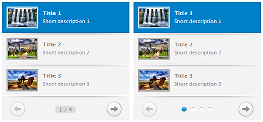
The navigation bar also contains the navigation buttons for the item pages and thumbnail paging information displayed as bullets or page numbers. The paging information (bullets or page numbers) are displayed by setting the component's thumbnailPaging property to bullets or numbering.
Customizing the bullets
The bullets can be easily customized by changing the bullet images for each of their states (normal, hover, selected), exactly like changing the bullets for the SliderWall Bullets template. Further customization can be done by editing the styling rules for the classes applied on these bullets: .sw_page_bullets (the CSS rules for the bullets container), .sw_page_bullets, .sw_page_bullets:hover, .sw_controlBar_bullet_selected and .sw_controlBar_bullet_selected:hover (for the states of the bullets).
Customizing the page numbering
The page numbers are displayed in the format page_number/total_pages and are placed within their own container, which can be customized and positioned independently of the other list elements. The .sw_page_numbering CSS class contains the styling rules for this container. The page numbering can also be customized separately by editing the styling rules of the .sw_page_numbering class.
Customizing the page navigation buttons
The previous/next thumb page buttons can also be styled separately from other list elements. The buttons have separate states for the normal, hover and selected state. By default, the selected:hover state is the same as the selected state so users won't be confused when the mouse rolls over a disabled button. You can setup the buttons by editing their CSS classes: .sw_controlBar_previous_thumb_page_button, .sw_controlBar_previous_thumb_page_button:hover, .sw_controlBar_previous_thumb_page_button_disabled, .sw_controlBar_previous_thumb_page_button_disabled:hover, .sw_controlBar_next_thumb_page_button, .sw_controlBar_next_thumb_page_button:hover, .sw_controlBar_next_thumb_page_button_disabled and .sw_controlBar_next_thumb_page_button_disabled:hover.
Customizing the margins
The margin containers of the list can be used as margins or borders by setting their size according to your needs or they can be used as containers for design elements (special margins or backgrounds).
Note: If you don't need margins for your playlist (the items list has the same size as the playlist) we recommend setting the width and height attributes to 0px (no size at all) so that the browsers can ignore displaying them - some browsers might interpret differently if width is 100px and height is 0px.
Customizing the list items
The items of the vertical and horizontal list each contain a thumbnail image container and two text containers for a short title and description of the corresponding slide. When using the HorizontalList or VerticalList templates as RSS viewers, the title for each RSS article will be placed inside the title container of the items and the thumbnail and description will not be used (please see the RSS skinning example).
The list items also have two states: the normal state and the selected state. Each of these states can be separately customized from their corresponding CSS classes. The common attributes of the items can be customized from the .sw_controlBar_item and .sw_controlBar_item_selected, but the background settings must be made from different CSS classes. This is because the lists have the possibility to slide the selected state background from one selected item to another so that background must be placed in a separate container. The classes used for the background of the items are .sw_controlBar_item_background and .sw_controlBar_selectedItem_background.
You can also specify item backgrounds from the .sw_controlBar_item and .sw_controlBar_item_selected classes but those backgrounds will be always visible and will not slide from one item to another during the item selection process. This is the case of the top shadow margins of the items from the default skins.
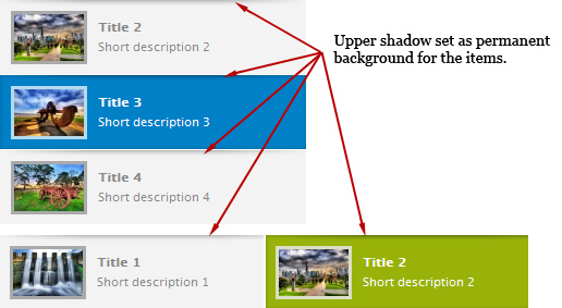
As mentioned previously, the grey color for the normal state item and the blue and green background colors for the selected items are set from their own CSS classes: .sw_controlBar_item_background and .sw_controlBar_selectedItem_background.
Note: For the first and last items on each page there are two separate CSS classes for styling rules, in the case the first and last items should look a little different that the rest of the items (extra artwork or other design elements): .sw_controlBar_item_first_on_page and .sw_controlBar_item_last_on_page. For example, the design of the default skin for the VerticalList template requires the first item not to have the top shadow and that the last item should be slightly larger with a white bottom border.
The title and description text also have their separate CSS classes for styling, one class for the normal state and one for the selected state: .sw_controlBar_title, .sw_controlBar_title_selected, .sw_controlBar_description and .sw_controlBar_description_selected. Finally, the thumbnails can be customized (size, color, background) by editing the styling rules from the .sw_controlBar_thumbnail and .sw_controlBar_thumbnail_selected CSS classes.
TopChange timer size and position
The timer is always changing its width value according to the slideShowSpeed property and the max-width CSS attribute. To set a maximum size for the timer element you must use the max-width attribute within the .sw_timer CSS class.
Note: You should not specify the width attribute because the timer will no longer work correctly.
Bullets and Thumbs templates
For the Bullets and Thumbs templates the timer has a default position right below the control bar. By changing the timerPosition (aboveControlBar/belowControlBar) property of the SliderWall component you can set the position of the timer above the control bar. When the mouse rolls out of the slider surface and the autoHideControlbar property is set to true, the slider will automatically position the timer to the bottom. For this default action, the timer's position must be set to -1px in the .sw_timer class:
.sw_timer {

  top: -1px;

  left: -1px;

}
The timer can also be positioned elsewhere by changing the default left/top values. If the left and top attributes have values larger than 0px, then the default functionality will be overwritten and the timer will always keep the position set in its CSS class:
.sw_timer {

  top: 10px;

  left: 10px;

}
Besides the position, you can also change the timer's color and size from the .sw_timer CSS class.
HorizontalList and VerticalList templates
For the HorizontalList and VerticalList templates the timer no longer has a default functionality, the slider simply positions it according to the styling rules specified in the .sw_timer class. This way, the timer can be positioned using the top, left, right and bottom attributes and resized to fit within the slides, using the width and height attributes.
Note: For these two templates, the timer is placed within the slider container itself and cannot be displayed outside of it (for the default skin, the timer cannot advance over the playlist - it will remain within the boundaries of the slide).
TopStyling a RSS reader
When using SliderWall as a RSS reader, the component will no longer need to have a <div> tag defining its content because the content will be retrieved directly from the RSS feed. The interface of the slider will look exactly as defined from its CSS file and will display the controls (control bar, navigation buttons, timer) according to the slider settings. The slider will automatically retrieve the title from the <title> definition for each RSS article and display it over each slide. The title of the articles can be hidden using CSS styles, if the design requires it.
For the HorizontalList and VerticalList templates, the title of the articles will be displayed within the list items. The items will contain only the title of the RSS articles, without any thumbnails or description text. The title text can be setup from the .sw_title CSS class. The .sw_description and thumbnail CSS rules will be ignored.
The articles can also be styled using CSS styling rules, depending on their HTML content. Please consult the RSS examples for more information.
Top